What Is a Brand Guide (And Why It's the First File Every Developer Should Open)
Ever landed on two pages of the same website and felt like you'd wandered into two different companies? Different blues. Different fonts. A logo squished to fit a header. That disconnect almost always traces back to one missing thing: a brand guide.
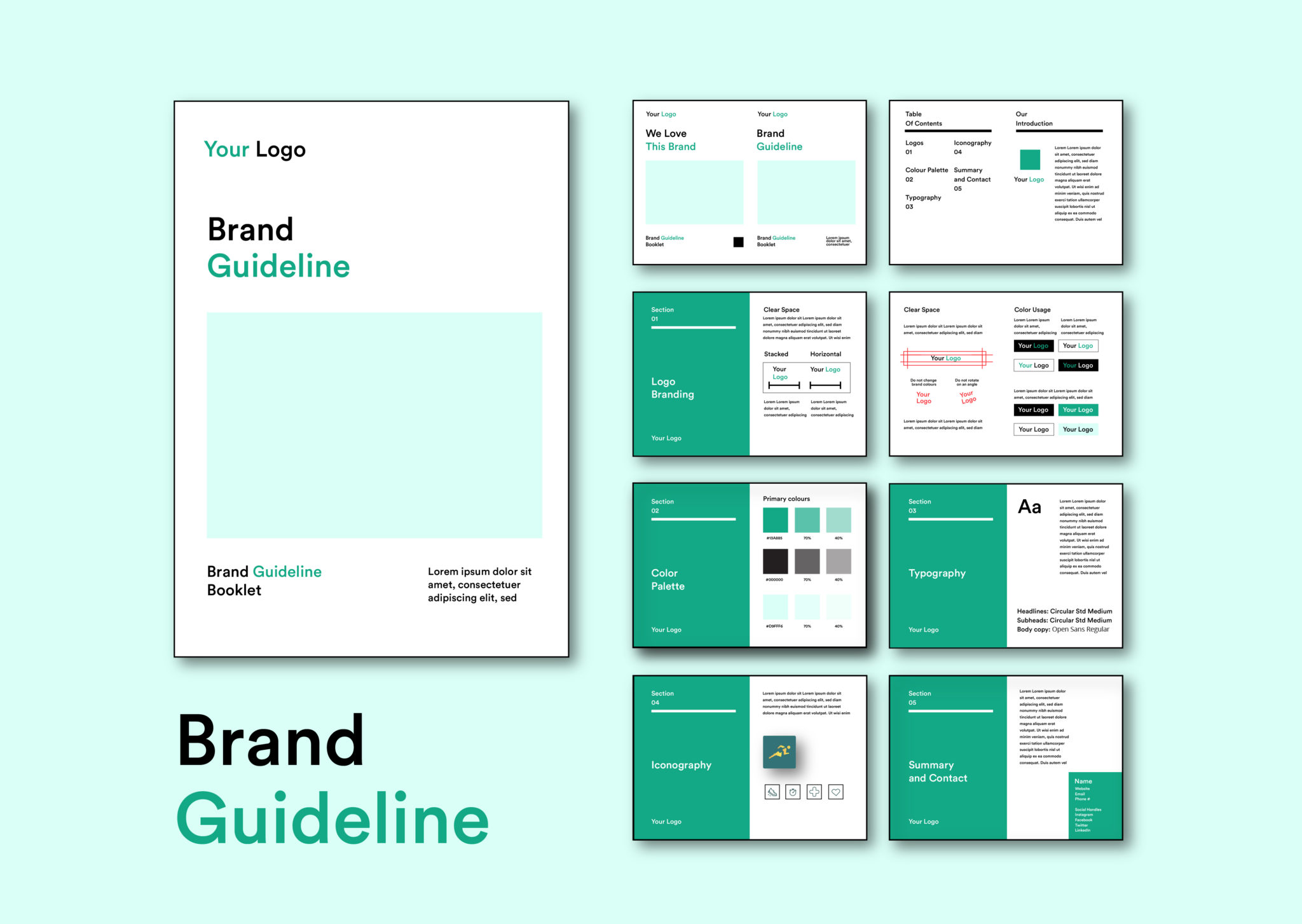
A brand guide — sometimes called brand guidelines or a style guide — is the rulebook for how a company looks, sounds, and feels everywhere it shows up. It's not a nice-to-have for the design team only. It's a working document that designers, marketers, developers, and outside vendors all pull from so the brand stays recognizable no matter who's building what.
What's Actually Inside One
Visual identity
- Logo usage — approved versions, clear space, minimum size, and the misuses to avoid (stretching, recoloring, cramming it onto a busy background)
- Color palette — primary and secondary colors, specified in HEX, RGB, and CMYK so they render the same on a screen and in print
- Typography — approved typefaces for headlines and body copy, with sizing and hierarchy rules
- Imagery style — the mood of photography, illustration style, and iconography
Voice and messaging
- Brand voice — the personality behind the words (playful, authoritative, warm — whatever it is), usually shown with do's and don'ts
- Taglines and messaging pillars — the core phrases that shouldn't be reworded on a whim
- Tone shifts — how voice bends between a support email and a launch campaign
Application examples
- Mockups of the brand in the wild: business cards, social posts, packaging, slide decks
- Ready-made templates so nobody starts from a blank page
Governance
- Side-by-side do's and don'ts
- Trademark and legal notes on using the logo or name correctly
Why It Matters (Beyond Looking Nice)
- Consistency builds recognition. People start to know a brand by its color or type alone, before they even read a word.
- Efficiency. New hires and outside vendors get up to speed fast instead of guessing.
- Trust. A cohesive look and voice quietly signals "this company has its act together."
The Part Most Brand Guides Forget: Developers and Designers
Marketing usually commissions the brand guide, but nobody depends on it more than the people actually building the product. Here's why it matters specifically for developers and website designers:
1. It removes guesswork from implementation. A guide with exact HEX values, font files, and spacing rules means a developer isn't eyeballing "close enough" blue from a PDF screenshot. That precision is the difference between a design that gets built once, correctly, and one that gets patched five times after launch.
2. It becomes the source of truth for a design system. Modern brand guides increasingly double as the seed for a design system — the color tokens, type scale, and spacing units in the guide map almost directly to CSS variables, Tailwind config, or a component library. A developer building a button component isn't inventing padding and border-radius from scratch; they're translating the guide into code.
3. It prevents brand drift across a growing codebase. As a site or app scales — more pages, more contributors, more third-party embeds — small inconsistencies creep in fast. A brand guide (especially paired with a component library) acts as a constant reference point so a contractor's landing page still looks like it belongs to the same company as the core product.
4. It speeds up handoff between design and dev. When a designer's Figma file and the brand guide agree on every value, there's far less back-and-forth over "is this the right green?" or "which font weight is this?" That saved time compounds across every sprint.
5. It protects responsive and accessible design. Good brand guides increasingly specify color contrast ratios, minimum touch-target sizes, and font fallbacks — details a developer needs to hit accessibility standards (like WCAG) without having to make judgment calls that legal or design will later flag.
6. It's a safeguard during redesigns and rebrands. When a brand evolves, a well-documented guide tells a developer exactly what changed — a new primary color, an updated logo file, a revised type scale — so the migration is a checklist, not an archaeology dig through old style sheets.
The Bottom Line
A brand guide isn't paperwork sitting in a marketing drive. For a developer or website designer, it's closer to a technical spec: it tells you the exact values to build with, the constraints to respect, and the reasoning behind them. Treat it that way, and the gap between "what the brand should look like" and "what actually ships" gets a lot smaller.